Differences in High School SAT Math Scores by County in Illinois
School Project Sample
Introduction
The Scholastic Aptitude Test (SAT) is one of the many standardized tests in the United States used for college admittance. In 2017, the Illinois State Board of Education decided to switch the previous state-wide standard testing, the ACT, to the SAT for high school juniors. Instead of a composite score ranging from 1 to 36 from the ACT, the SAT scores are out of 1600 points in total for all four subjects: Reading, Math, Writing and Language, and an Essay. Since then, the SAT has become the most population college admission test in the United States.
SAT Math scores tend to be lower on average compared to EBRW (Evidence-Based Reading & Writing) scores on a national average. Illinois has some of the lowest SAT math and EBRW scores compared to its neighboring states (498 for Math; 508 for EBRW).
The focus of this project will be on visualizing where the highest and lowest SAT math scores are situated in each county for the 2019 school year.
Method/Visualization Techniques The data used here to visualize the average SAT math scores across Illinois counties is from the Illinois State Board of Education Data Library archive from the 2018-2019 report card in the form of an excel spreadsheet. This data has not the average SAT scores for reading and mathematics, but the percentage of the total scores by race & ethnicity, IEP, income level, and ELA participation.
In addition, a shapefile of Illinois Counties and an excel table of the total population for 2019 were obtained from the National Historical Geographical Information System (NHGIS). This data had the latitude and longitude necessary to plot and identify all 102 counties.
Out of the many variables from the 2018-2019 Illinois Report Card, only two were selected:
SAT Math Average
% of Students’ SAT Math Participation
The focus here was only on Math SAT scores, as students overall tend to perform less than compared to EBRW.
The state of Illinois was visualized and all counties in order to include all average SAT math scores into my data set.
Quintile classification of color was used to rank the average math scores from lowest to highest. The colors helped established a good relationship.
A scatterplot and a box and whisker plot were the final parts that were added, as they help map readers visualize not only the slight positive correlation of the math scores with each county but the difference between urban and rural counties.
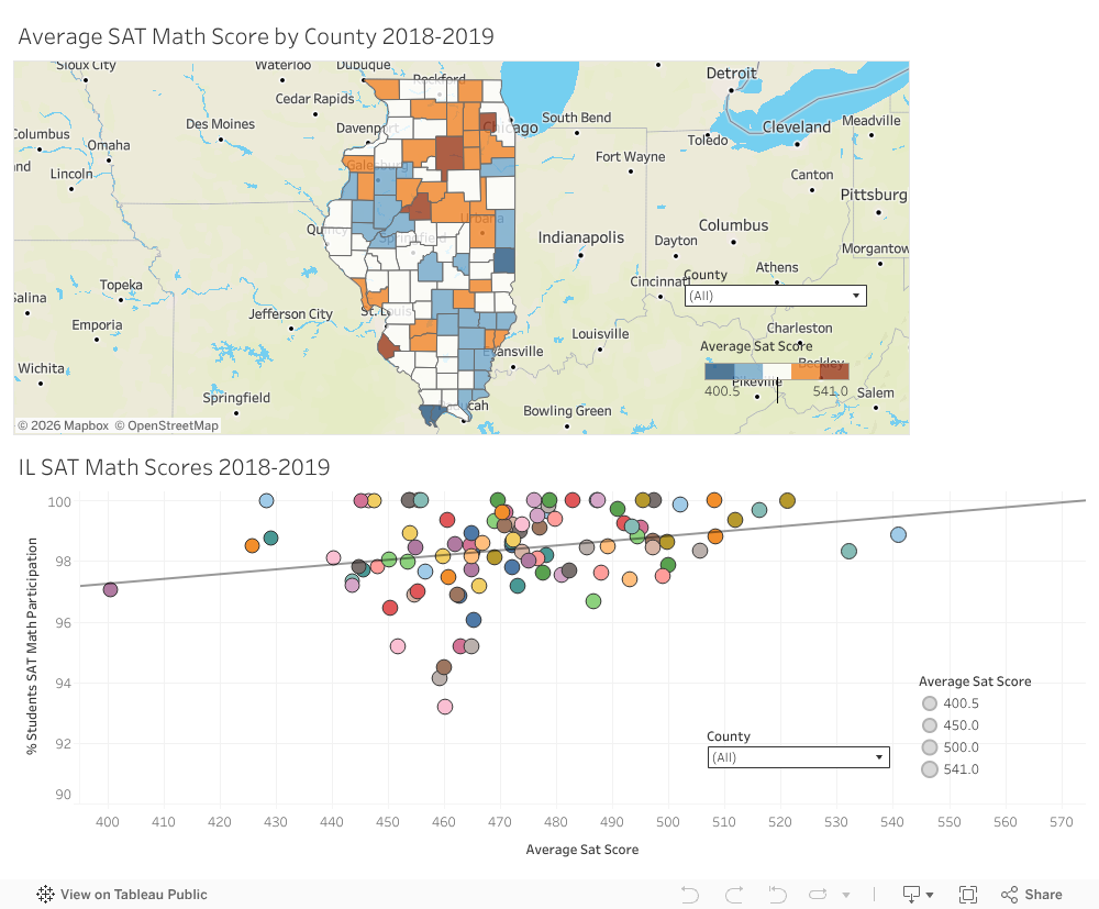
SAT Math Scores by Illinois County 2019 IG. 1: All Illinois counties and average SAT scores across the counties.
Relationship between Average SAT Math Score and Student Participation Results and Discussion From the box and whisker plot, we see that high schools in urban counties perform significantly better on the math portion of the SAT compared to high schools in rural counties. This can also be interpreted from the map due to there being a higher concentration of SAT math scores in the northern counties that are near the Chicago Metropolitan Area, and below-average SAT math scores being in central and southern counties.
For the map and scatterplot, it was very effective to add county as a filter so if map users are curious to see how an individual county preform (i.e., the county they live in for example), they can use the dropdown and filter out any county besides their desirable county. The five-interval color scheme was also used to effectively portray high and low math scores on average. Using both was an appropriate choice to help simplify the overall design of the map and help the map reading analyze and choose the Illinois counties they want.
Using the % of students’ SAT Math participation as the y-axis in the scatterplot was important because we want to see the overall trend line of the two variables—to show that if the x-axis increases, the participation on the y-axis increases. And in this case, the regression line indicates a strong, positive correlation between average SAT math scores and % of students’ SAT Math participation.
Dynamic mapping was an overall effective choice since users can freely pan, zoom in, filter the symbology, hover over a county, and gather the necessart information.
Conclusion For future maps and research into measuring different SAT scores in different states, using Illinois Report Card Metrics, and calculating the overall average in each individual school for each county is important if you want to get the precise scores.
Mapping a time frame to see how SAT scores change over the course of each school year, like from 2010-to 2020- for example, might be an interesting visualization project.
Overall, this project was an interesting one with only some minor roadblocks here and there, and it really helps visualize school testing performance in each county if the information is available.


Comments
Post a Comment